Live example
Properties
|
Name |
Values |
Default |
|---|---|---|
|
children |
ReactNode |
|
|
displayStyle |
'default' | 'outline' |
default |
|
background |
string | { src: string } |
|
|
size |
{ |
|
|
onClick |
MouseEventHandler<HTMLDivElement> |
|
|
onSelect |
() => void |
|
|
hasShadow |
boolean |
false |
|
style |
CSSProperties |
|
|
anchoredTopBadge |
{ |
|
|
... |
JSX.IntrinsicElements["div"] |
|
|
variant |
DEPRECATED |
|
|
inverted |
DEPRECATED |
|
|
inline |
DEPRECATED |
|
Native Properties
|
Name |
Values |
Default |
|---|---|---|
|
displayStyle |
'default' | 'outline' |
'default' |
|
background |
ImageSourcePropType | string |
|
|
size |
{ |
|
|
onPress |
() => void |
|
|
onSelect |
() => void |
|
|
hasShadow |
boolean |
false |
|
anchoredTopBadge |
{ |
|
|
children |
ReactNode |
|
Composition
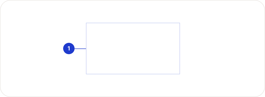
|
Tokens |
Native |
Web |
|---|---|---|
|
Background color |
color.surface.bright |
color-surface-bright |
|
Border radius |
border.radius[largeAndUp ? '2xl' : 'lg'] |
border-radius-2xl |
|
Border Width (outline) |
border.width.md |
border-width-md |
|
Padding |
largeAndUp ? space[600] : space[400] |
space-600 |